Big Board Gaming: Military History & Wargaming AARs
DAK 2 1941 January [Gallery ]
DAK2
One thought on “DAK 2 1941 January [Gallery ]”
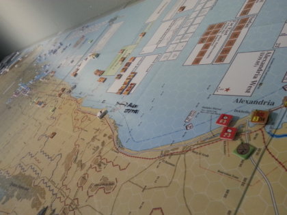
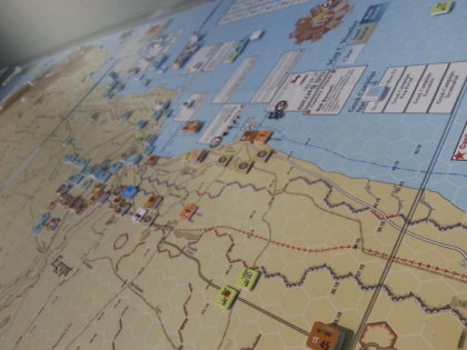
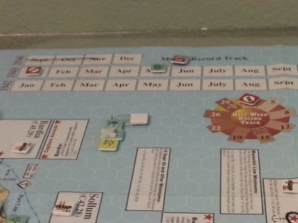
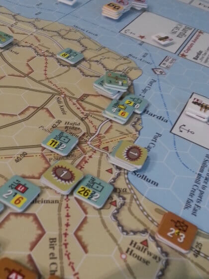
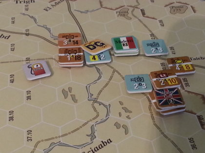
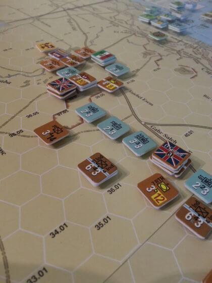
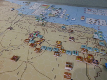
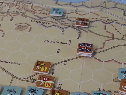
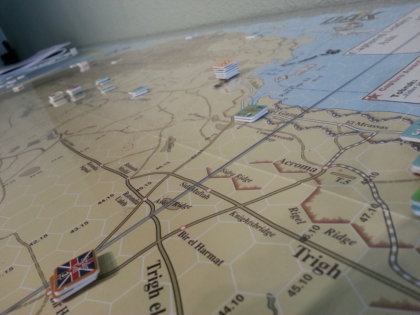
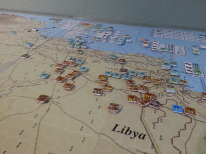
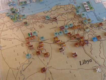
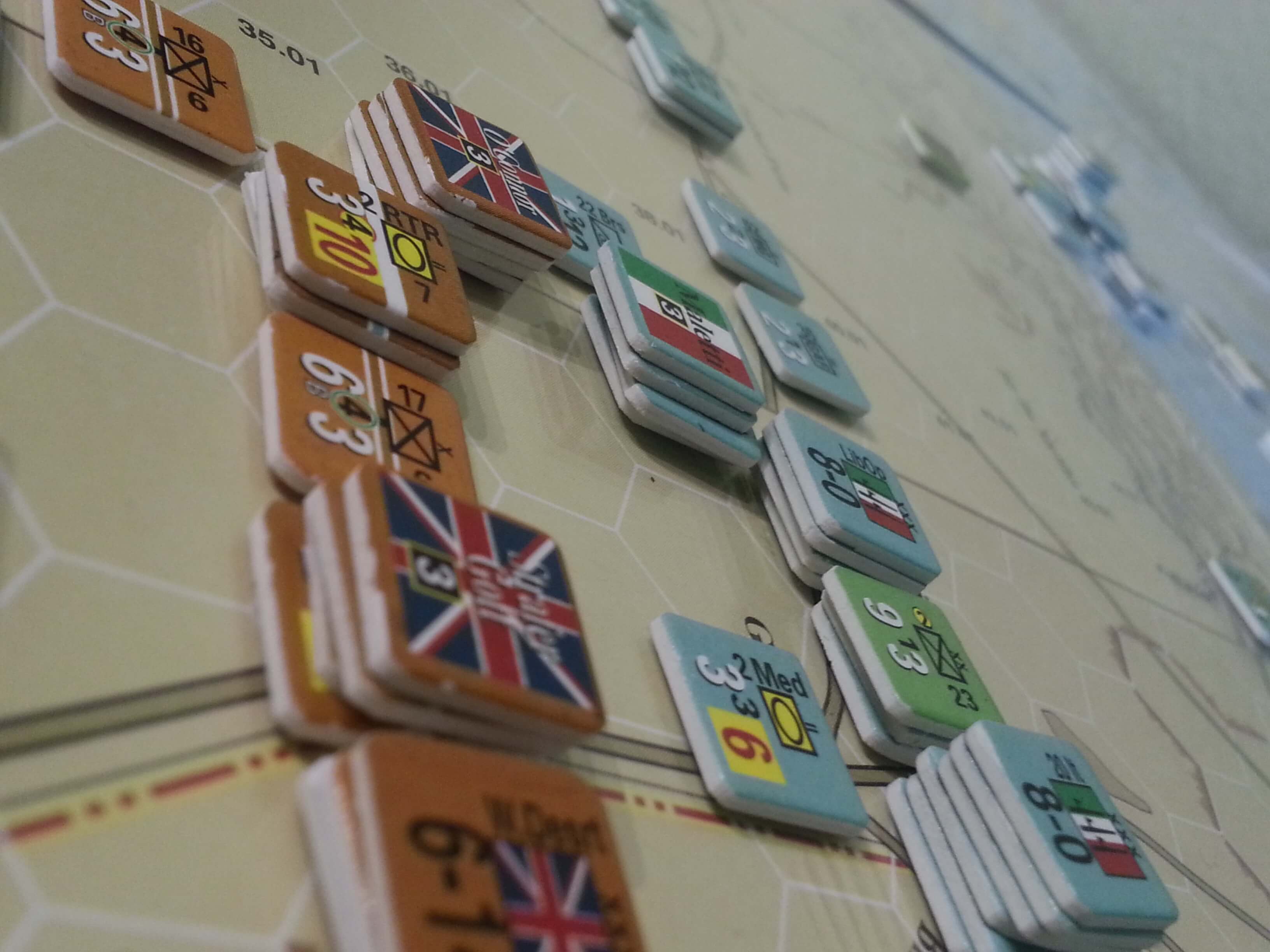
Some nice skewed perspective shots here give that “shot from outer space” feel.
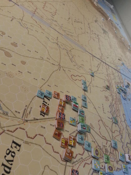
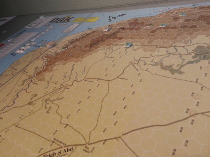
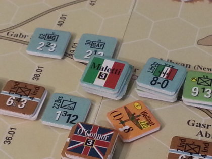
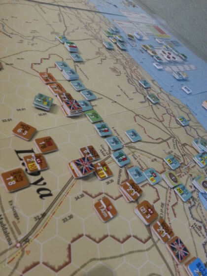
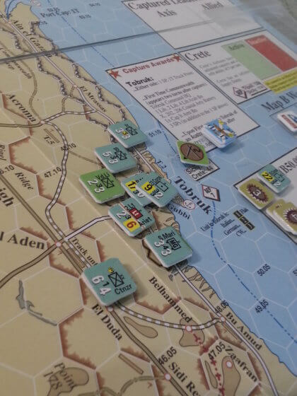
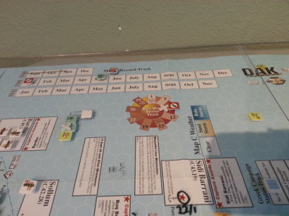
However, the rest of the shots are ruined by the game itself. It’s another example of MMP/The Gamers’ klunky, horsey, ham-fisted approach to graphics in all their games. Just bloody awful. From the white hex borders (black 1 point lines always work just fine) to the overly bold hex designations (but only in a few rows; what’s up with *that*?) to the horrible clashing colors of the units and the dump of so-called informational elements on them. Similarly, all the markers look like they were borrowed from another game; they appear to have no visual connection to the game at hand.
This company’s games always look like a color wheel exploded on them and left no possibility for anyone to survive. Eyestrain in a box.
Comments are closed.
📬 BigBoard Gaming on Substack — war stories, narrative, AARs.
Read & Subscribe →✕
Some nice skewed perspective shots here give that “shot from outer space” feel.
However, the rest of the shots are ruined by the game itself. It’s another example of MMP/The Gamers’ klunky, horsey, ham-fisted approach to graphics in all their games. Just bloody awful. From the white hex borders (black 1 point lines always work just fine) to the overly bold hex designations (but only in a few rows; what’s up with *that*?) to the horrible clashing colors of the units and the dump of so-called informational elements on them. Similarly, all the markers look like they were borrowed from another game; they appear to have no visual connection to the game at hand.
This company’s games always look like a color wheel exploded on them and left no possibility for anyone to survive. Eyestrain in a box.