I’ve always found it interesting to look at statistics, and measurement of conflicts in relation to one another.
http://www.poppyfield.org Have a data visualization tool up that allows you to look at duration, location across a timeline of many of the major conflicts since 1899. [Note I did not include Africa or Europe in the first image due to lack of activity.]
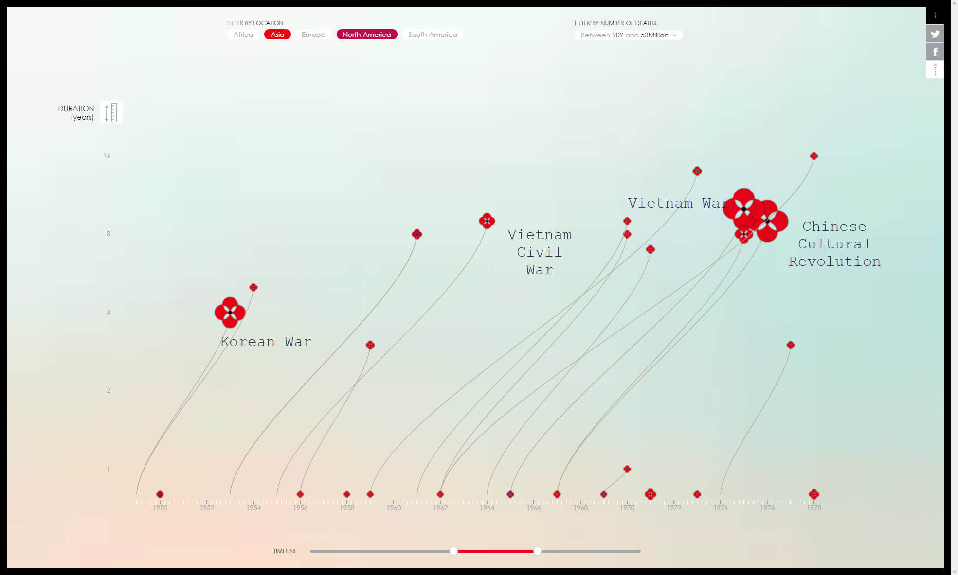
This first image is from 1949 through 1978.
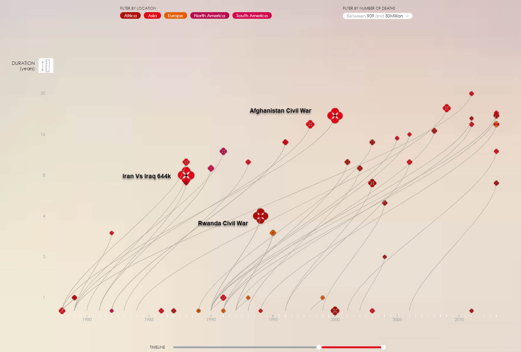
This next image covers post Vietnam thru 2014. You can see the casualty rates decline but durations extend significantly as well as a massive up tick in the number of instances of revolts, coups, wars and insurrections occur.
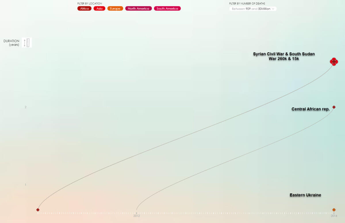
For the last image I zoomed in on 2010 through 2014 time line and it was somewhat encouraging to see a reduction in the district instances, but once again a prolonging of the wars which of course increase damages beyond just the human toll.
Does that include civilian casualties?