Big Board Gaming: Military History & Wargaming AARs
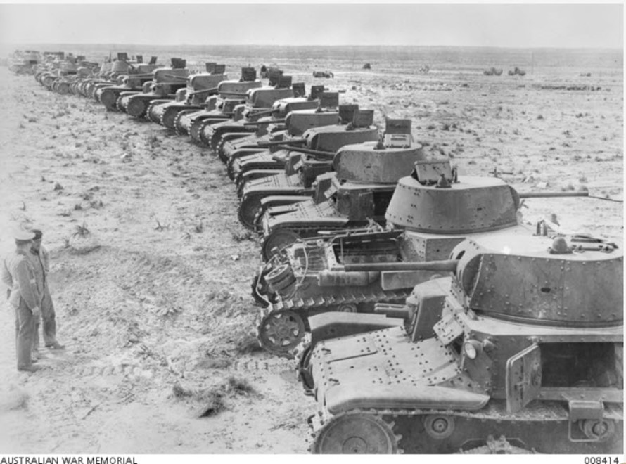
DAK 2 1941 June [Gallery]
3 thoughts on “DAK 2 1941 June [Gallery]”
I suspect this series is a bit better developed than Desert Fox Deluxe, so you can scratch your itch for the Western Desert, and actually enjoy it!!!
Me, I just can’t get past how HOMELY this package is. Those horrid “burnt browns” on the counters (with clashing info boxes superimposed on them); the every-five-hex rows of too-bold hex numbers. The white hex borders (shy?? A 1 point black keyline works fine over a desert brown/tan mapboard. It’s just…. *ugly*.
I suppose, if there’s a good system underlying it all, one might be able to overlook these visual assaults on the eyes… but I’d have a hard time just getting this out of the box.
How much are you willing to sell for? 😉
🙂 FFS. my dogs butt is better developed than DFD. For sure.
Comments are closed.
📬 BigBoard Gaming on Substack — war stories, narrative, AARs.
Read & Subscribe →✕


I suspect this series is a bit better developed than Desert Fox Deluxe, so you can scratch your itch for the Western Desert, and actually enjoy it!!!
Me, I just can’t get past how HOMELY this package is. Those horrid “burnt browns” on the counters (with clashing info boxes superimposed on them); the every-five-hex rows of too-bold hex numbers. The white hex borders (shy?? A 1 point black keyline works fine over a desert brown/tan mapboard. It’s just…. *ugly*.
I suppose, if there’s a good system underlying it all, one might be able to overlook these visual assaults on the eyes… but I’d have a hard time just getting this out of the box.
How much are you willing to sell for? 😉
🙂 FFS. my dogs butt is better developed than DFD. For sure.