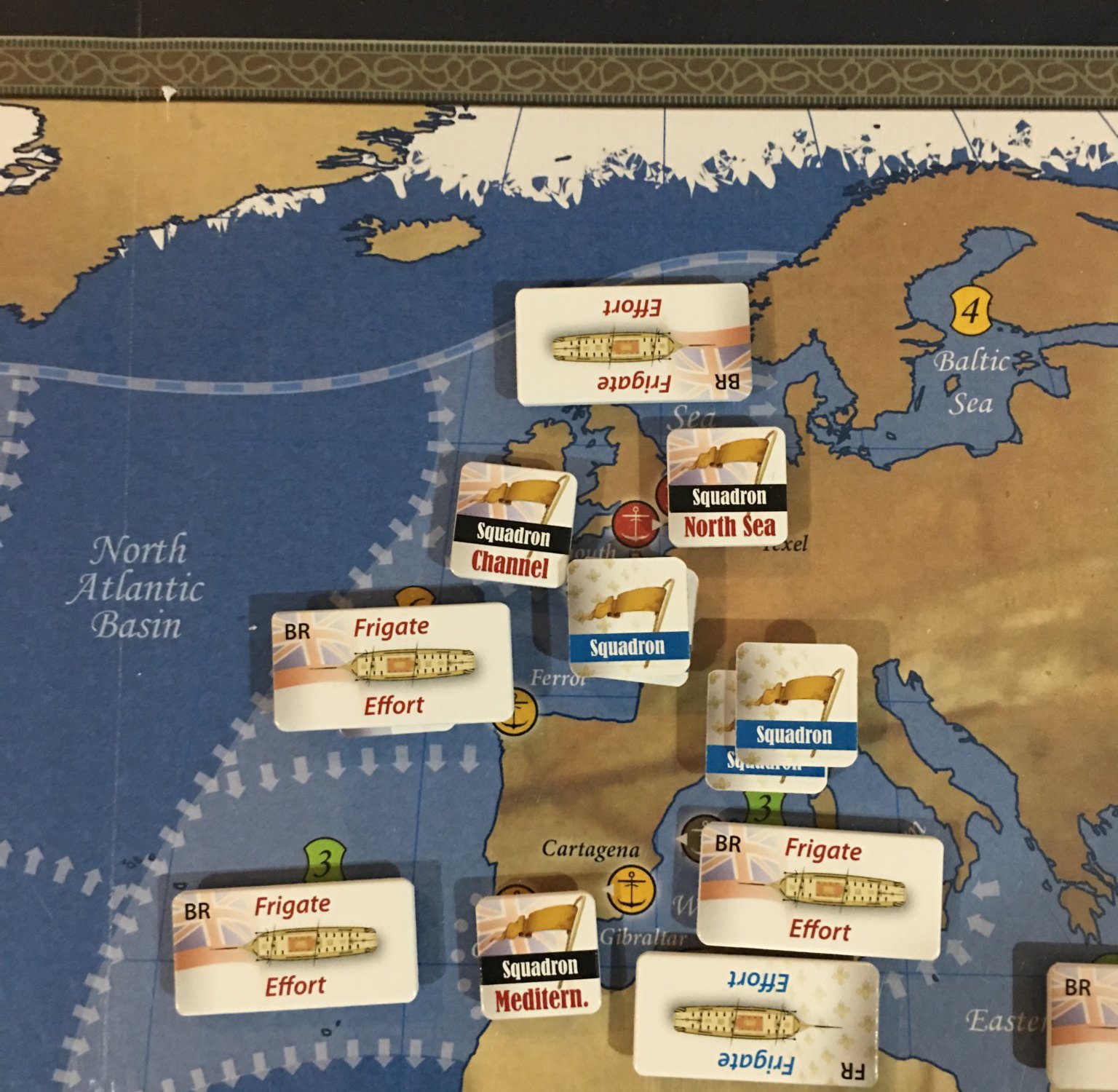
“All counter no map” was the header on the email that arrived recently. Folks have started sending me their images of poor design. Might be a fun series of images to post, along with a counter point #Good Design series!
A distressed reader shared the above image.
How would this be pleasing in your sight, let alone functional?
I believe that the Med is a small sea..well YOU DONT SAY!!! If you look closely you can see that the med is split into tiny areas where ‘forces, or squadrons are allegedly expected to fit. Can someone chime in here and tell me what the intent of this is? Does it actually work? Who has played?
Another example of an $85 shelf warmer. I’m told we can look for this on Ebay cheaply! We wont shame publisher, designer or map artist, as they say a picture is worth a 1,000 words.


LOL… how amusing. I would much rather all map no counter.
What a shameful execution of such a bold and clever concept. This game should have had maps at least twice the size the publisher provided. Although playable and “fun,” any similarity to the reality of warfare in The Great Age of Sail, is purely accidental. Another expensive mistake from a game-mill.
What game is this? Shaming is not the issue, informed choice is. I would certainly prefer to see this image before buying the game in question.
Even if you were only using Squadron markers, those are still too big. And the font on the Squadron counters immediately gives away the publisher, who seems to really love that font for some reason.
Yeah poor old compass
my point exactly these days. Back in the day when an S&T cost $5 (up hill both ways in the snow, 20 miles), if you got a turkey (Scrimmage, anyone) that was $5 bucks, Not a deal breaker, but now at $85??? How can these things be that expensive, (don’t answer, I know why) I don’t know. Why thats the price of 4.5 months of World of Warcraft. Thanks for your review tbb (what is your first name?)
Kevin
The more mistakes like this a game publisher makes without fixing it, moves me away from pre ordering their games and wait for the real player testers to show whats wrong with them.
I’ve wasted way too much money on bad game design/production decisions from these game publishers.
Thanks for bring this to our attention.
Cheers
No worries. But thanks concerned readers!
These are the reasons any real game company needs a good stable (or contact list) of top-notch graphics designers. Players are demanding innovative game systems…and the graphics need to keep up.
Agreed. That and some playtesters who are not yes men.