Yep its in the house!
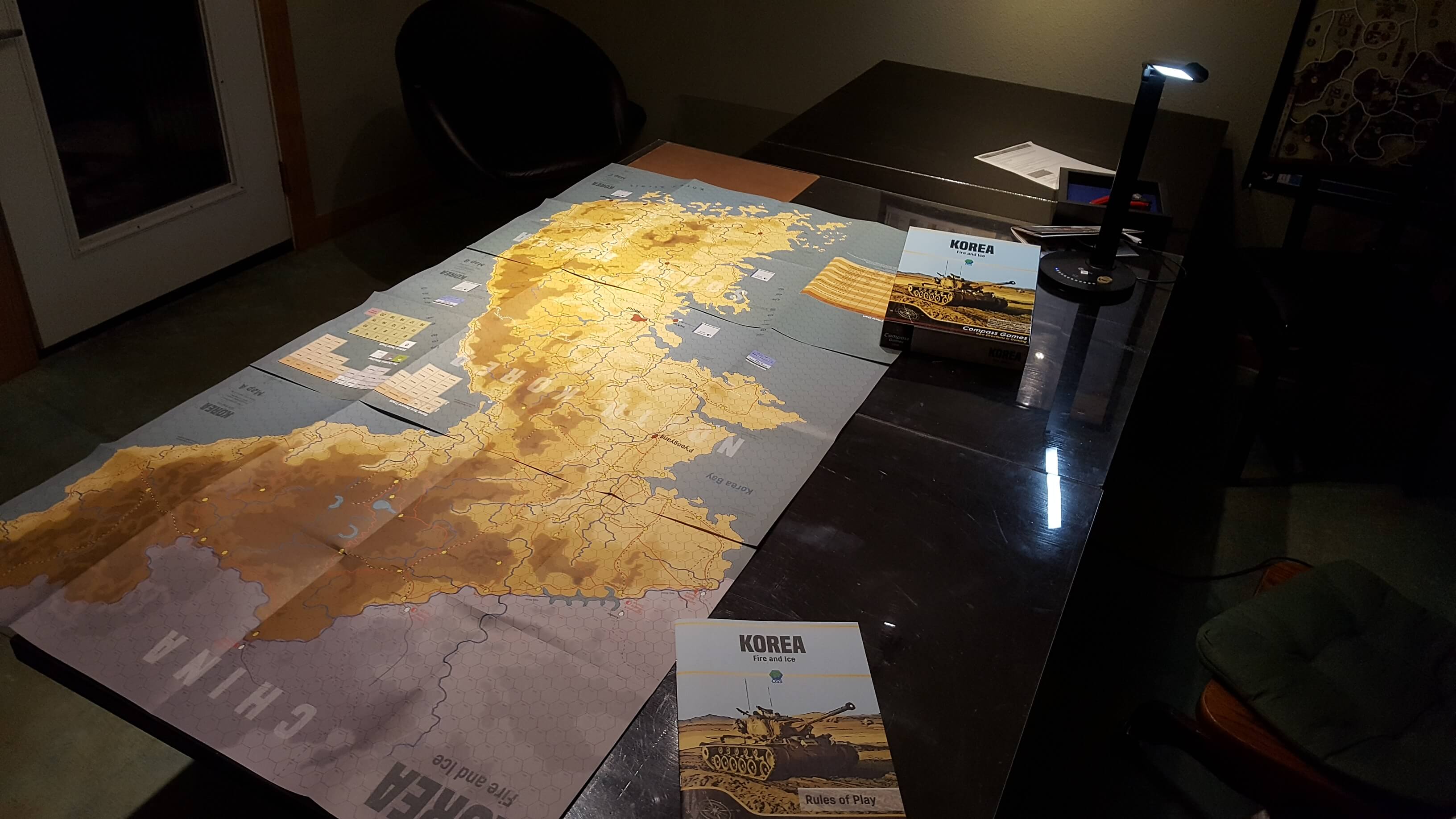
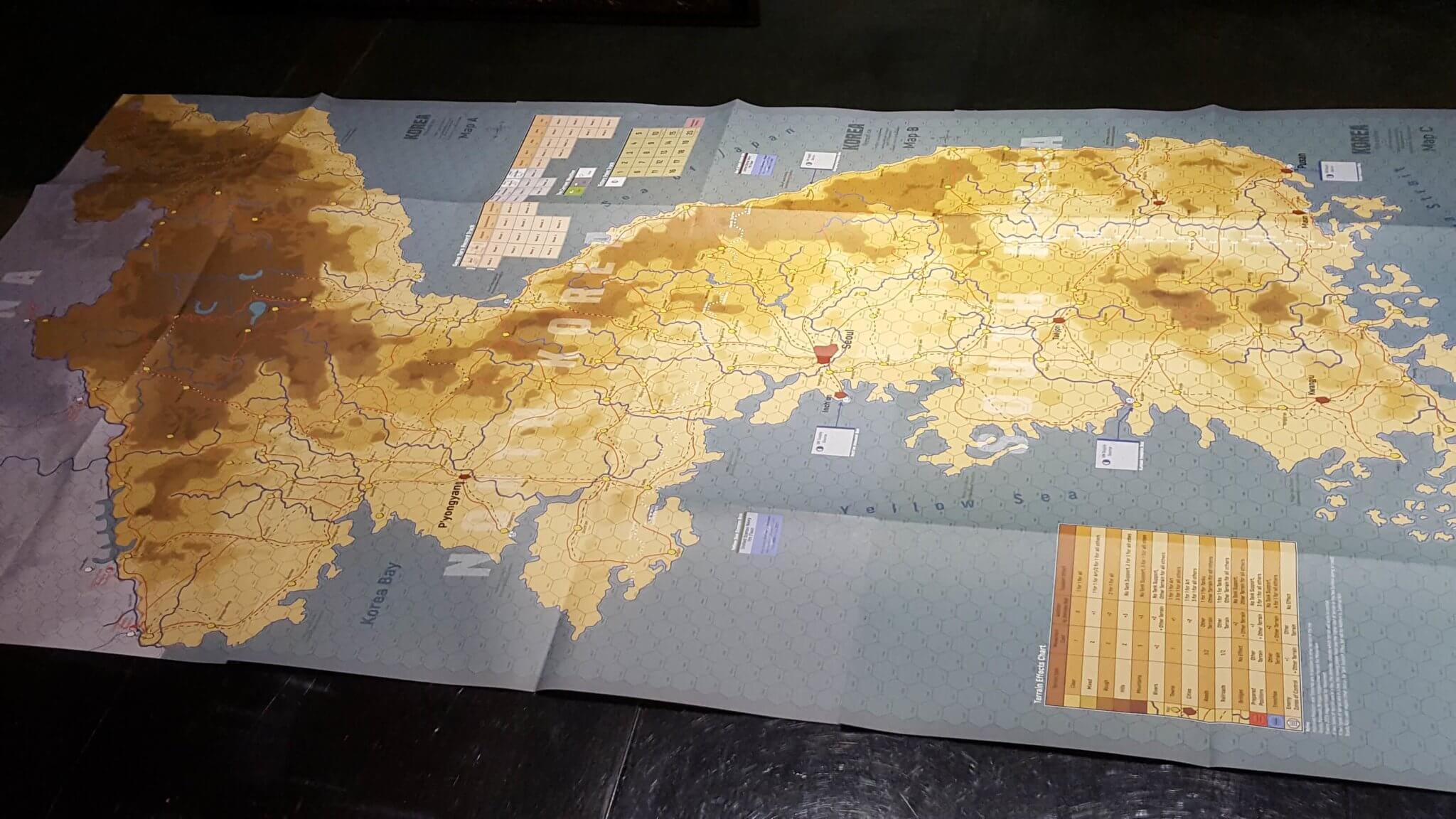
3 maps with large hexes. No excessive Sea space for the sake of largess. Nice.
Excellent print job on the maps. No painted on ink.
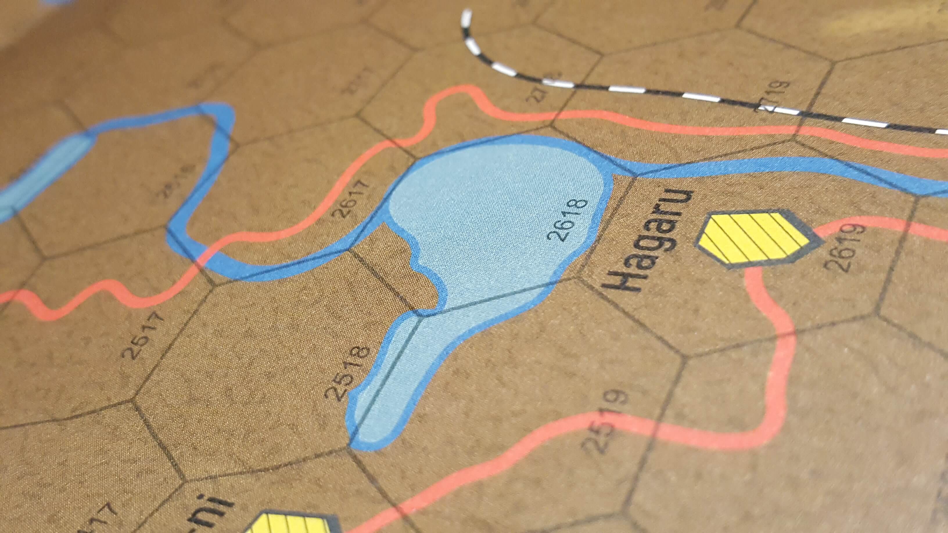
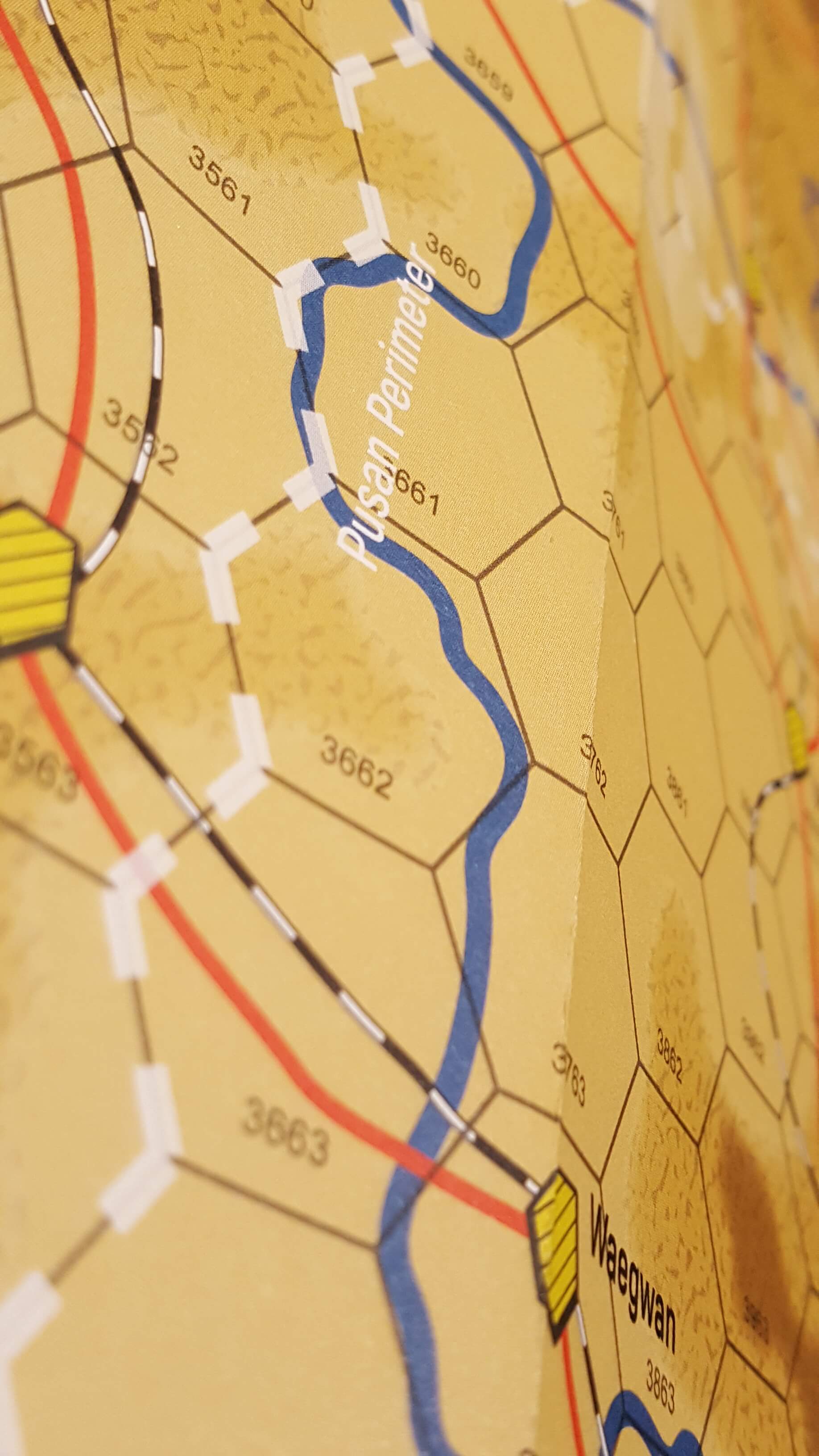
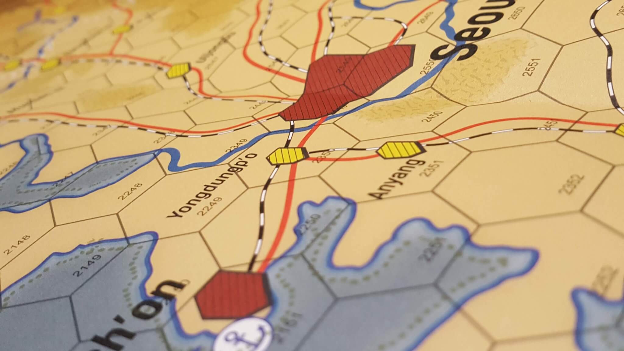
I think the art is simple but effective, while the terrain color choices as seen below evoke both a period feel and could I say a sense of foreboding? Is there such a thing from a color scheme?
The blend of clear and rough with two tones, and hills and mountains with two tones gives the whole thing a bleak aspect. Then you have the unknown Grey China to the far North. I might have left off the TEX on the maps left side given there are already 2 TEC charts.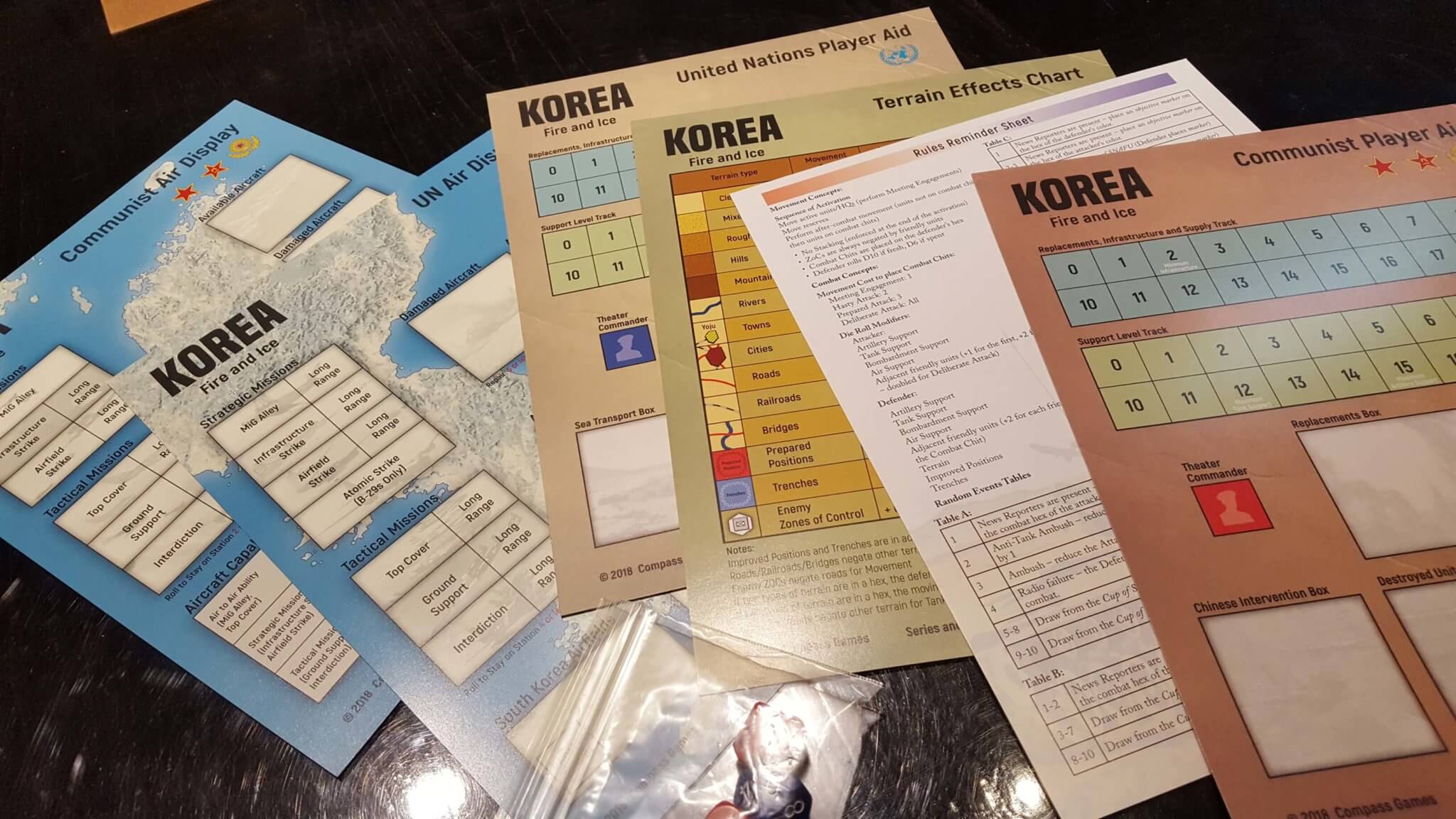
Because of the game system format there are a fair few types of information counters used –
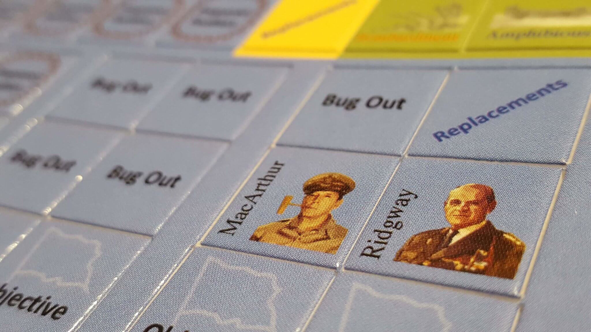
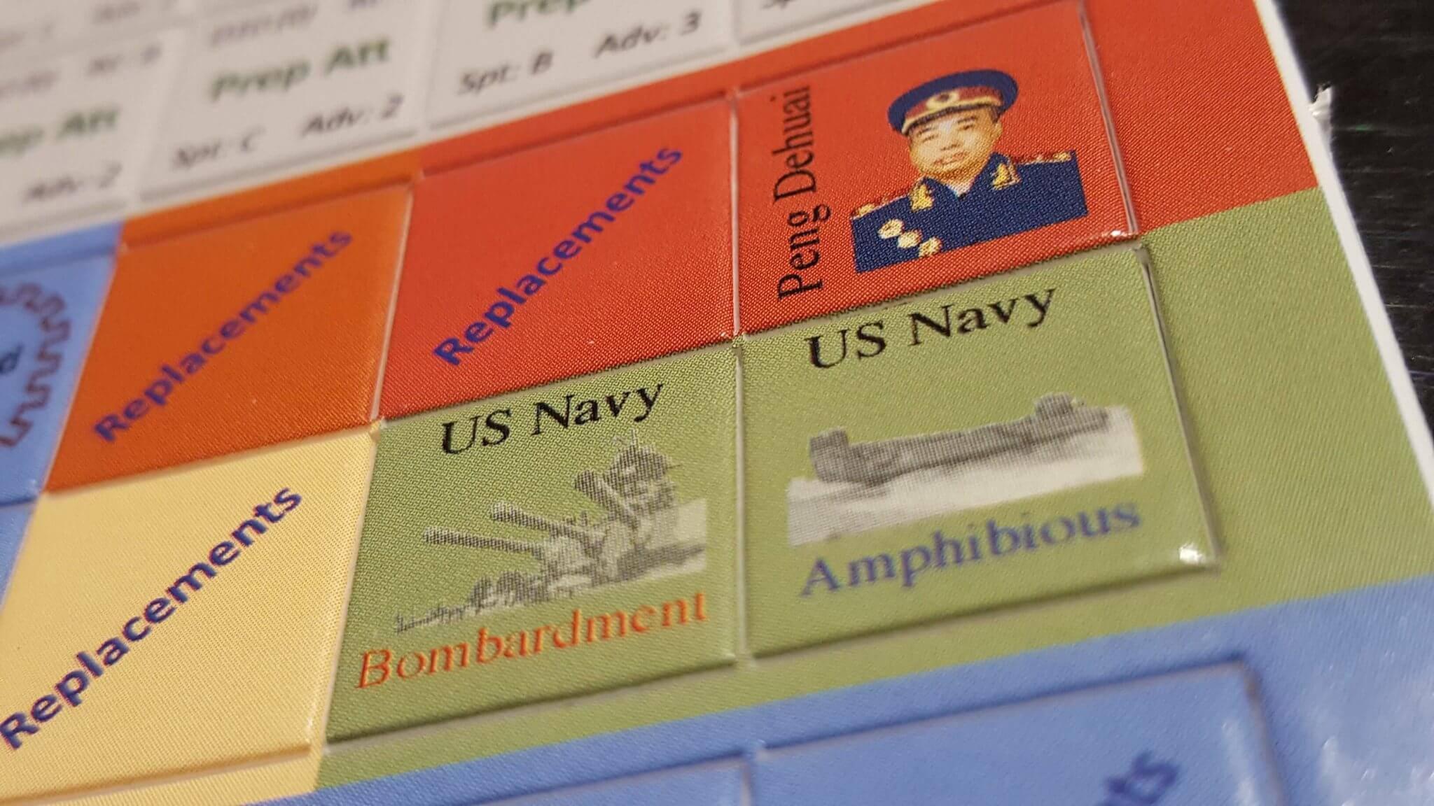
Combat Units and formations as well as Attack formation counters:
Im 2/3’s of the way thru the rules. There are a few bits and pieces I’v directed back to Compass, but overall the rules appear to be coherent and informative. The system will be different to play for sure. Probably not quiet as different as say Dean Essigs wonderfully mind bending BCS, but for sure different. More on the rule once we get a few turns in.
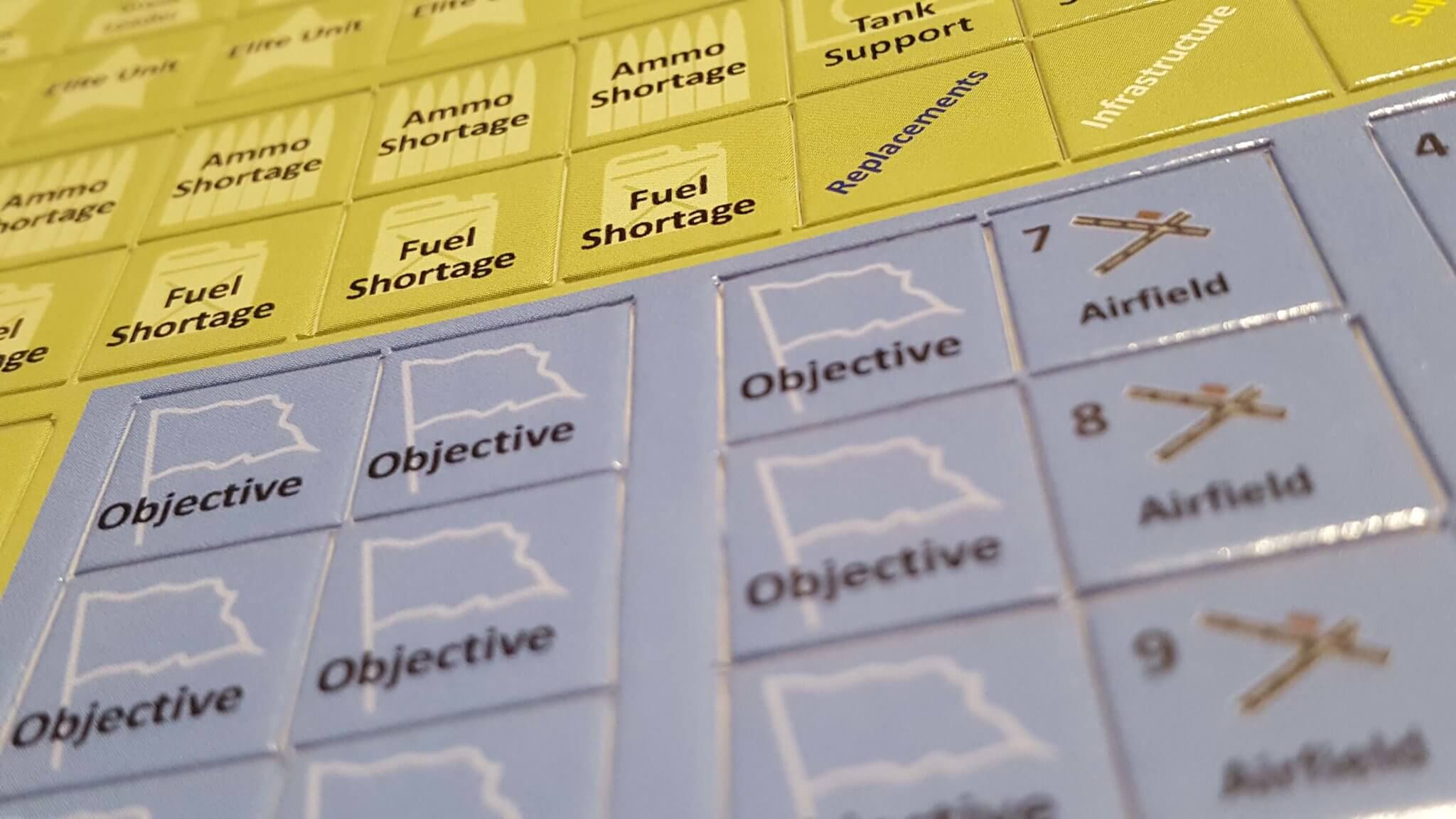
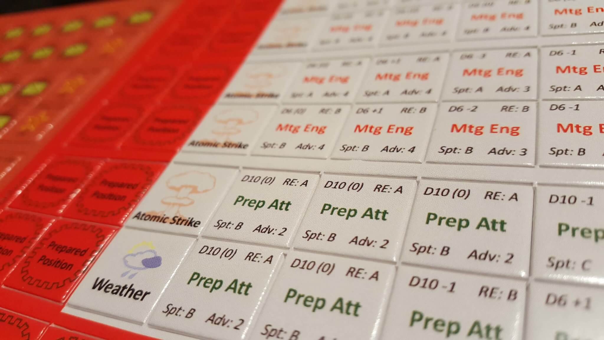
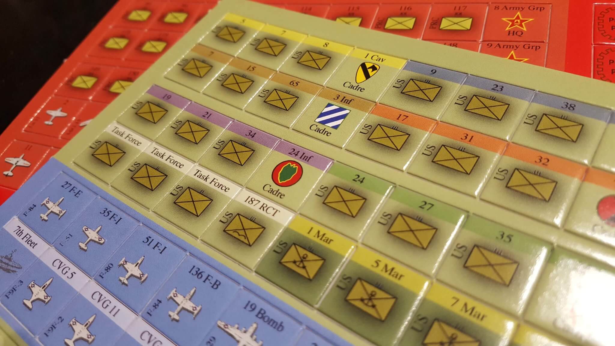
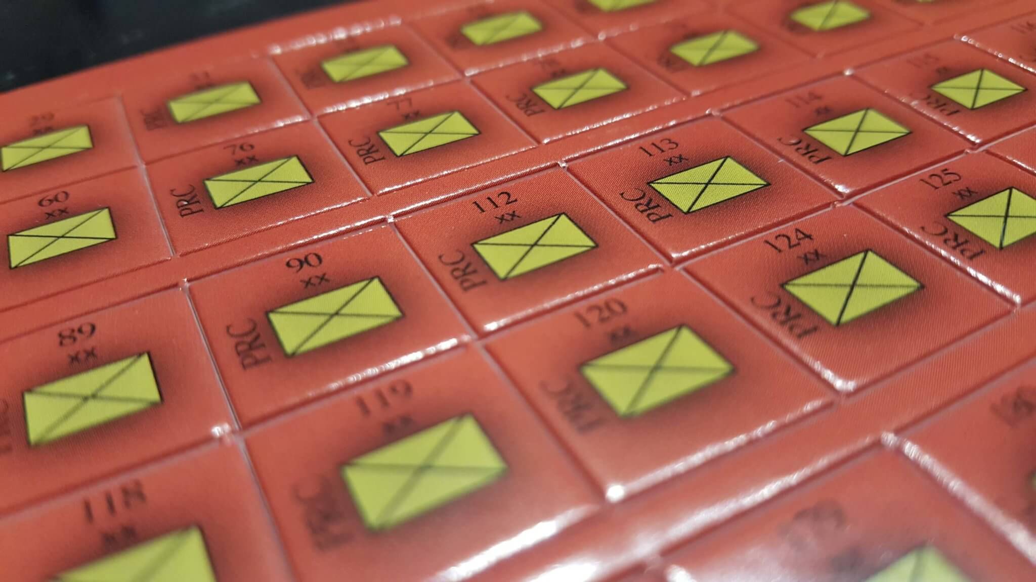
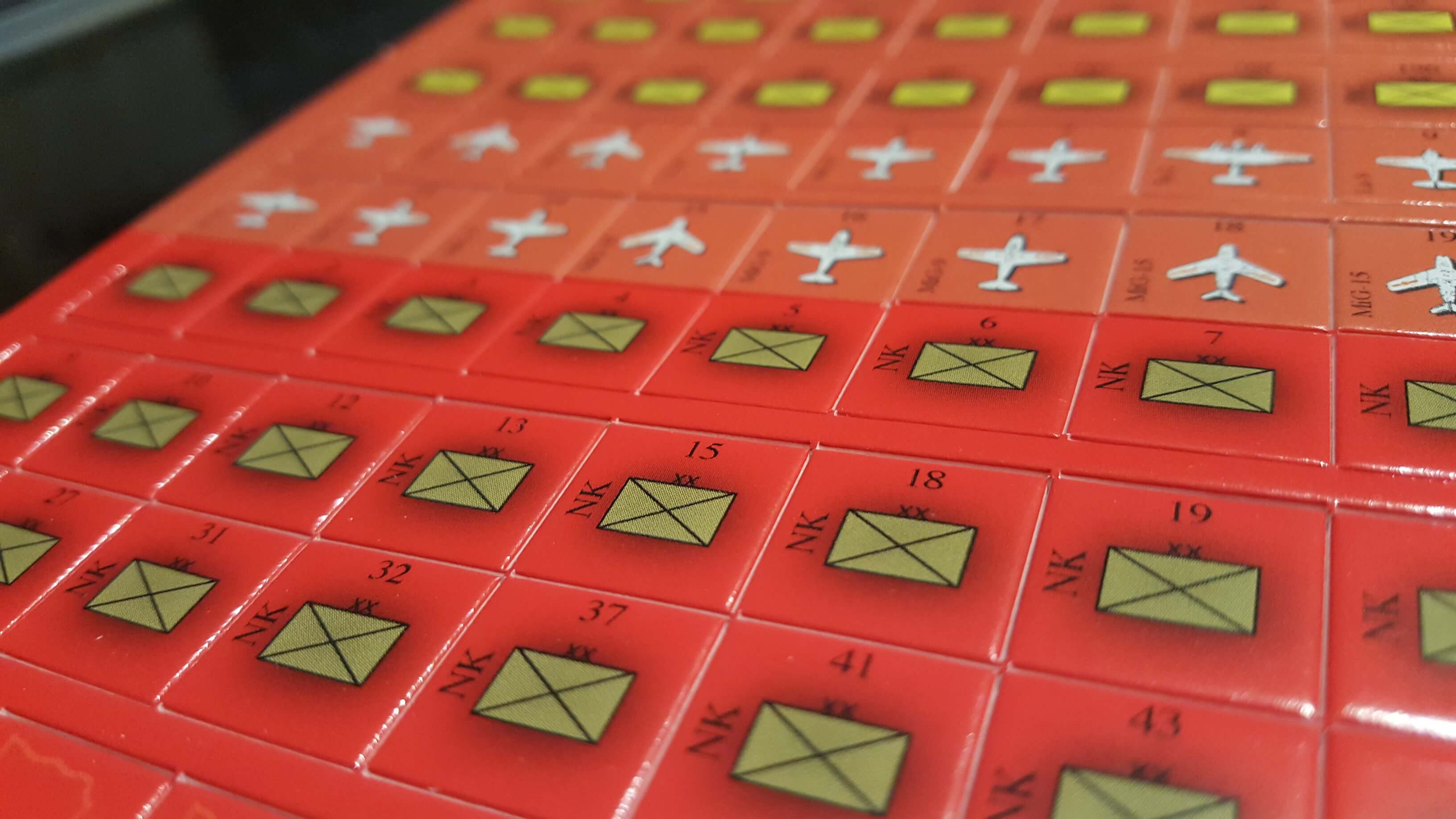
Nice looking components, that is for sure. Tastefully done, if a tad odd with no “values” on so many of the combat unit counters… this will make for an interesting playthrough video, eh?
A lot rides on Korea for success of the new OSS series. I just got mine, as well as Great War Commander. Looking forward to what you think of them.