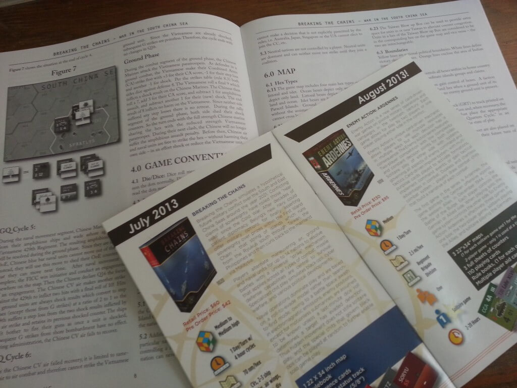
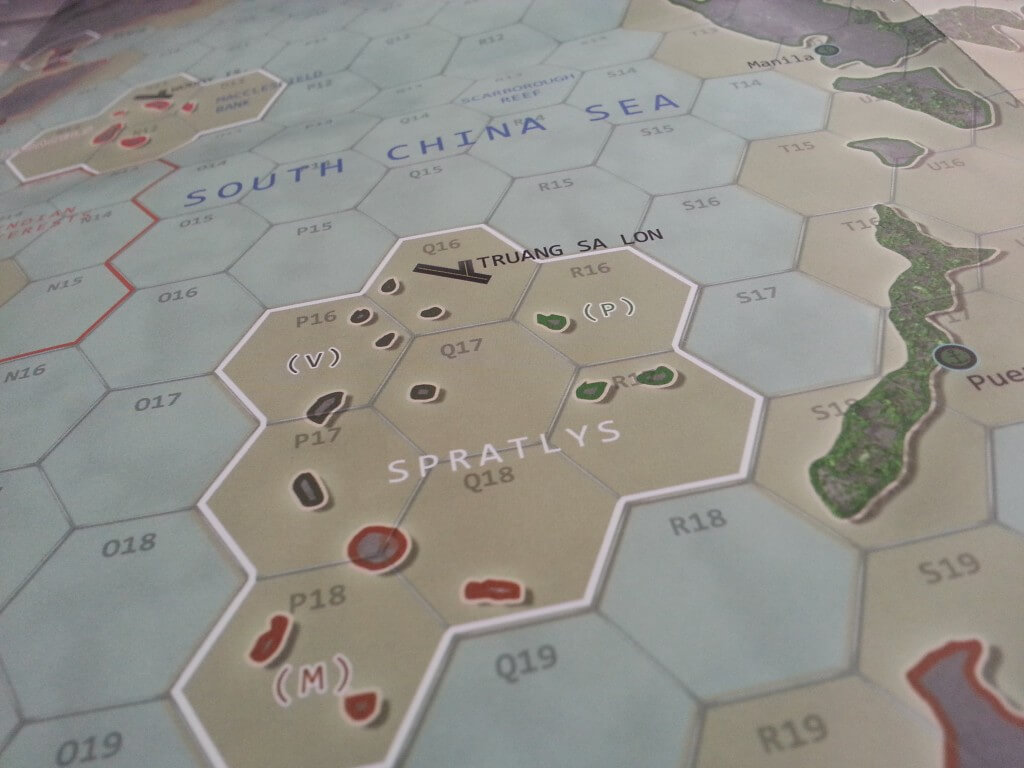
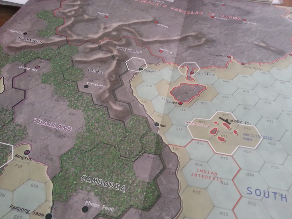
Some vanity shots for BtC.
It just arrived late last yesterday.
Ther had been some grumbling about the map art! layed out on the table it is muted and pleasant to the eye. Without being beautiful. A high functioning map.
It almost has a Orbital look to it, but not quiet in the vein of say Phantom Fury or A Week in Hell.
All the info counters are start white. The fonts stand up nicely.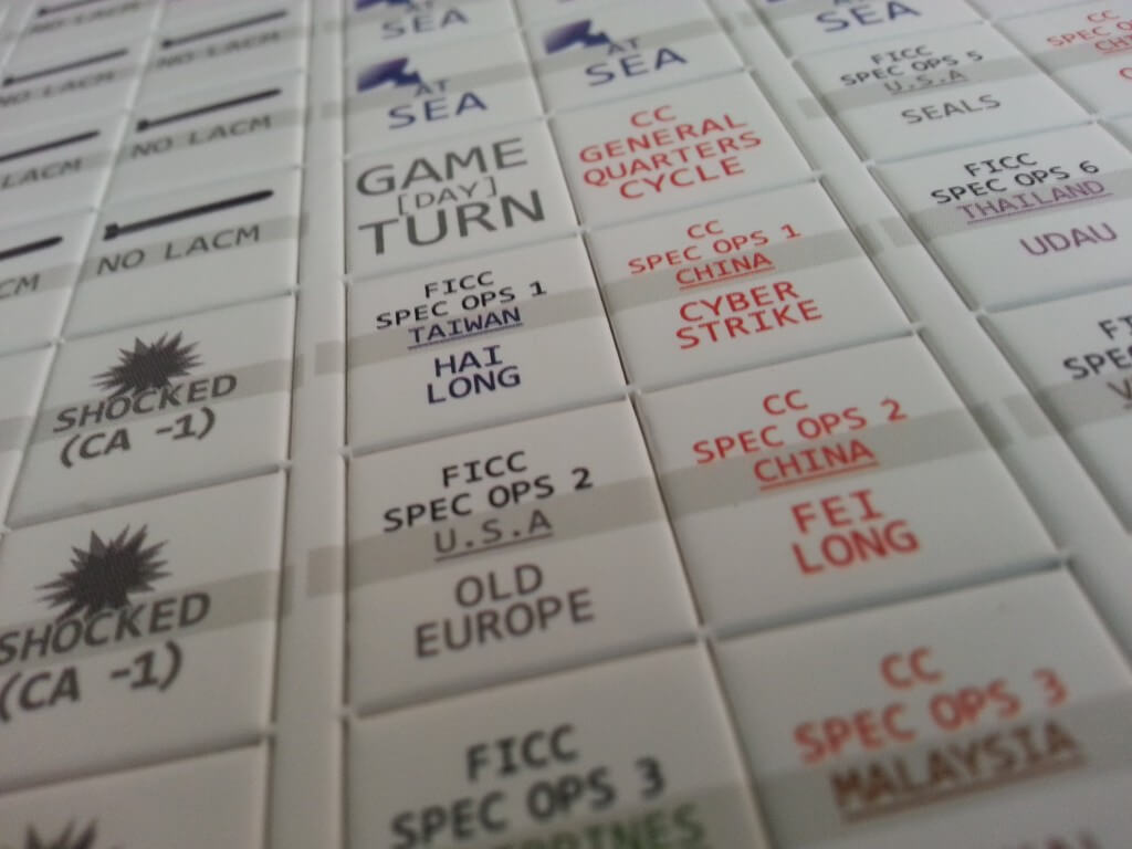
The unit counters will likely cause some artistic arguments. They are all soft detail silhouette style. The shading makes them look a little smudgy and the difference between unit types of air is readily apparent by nation type not shape of icon (Since the Chinese have been stealing Boeing designs for the last billion years no wonder.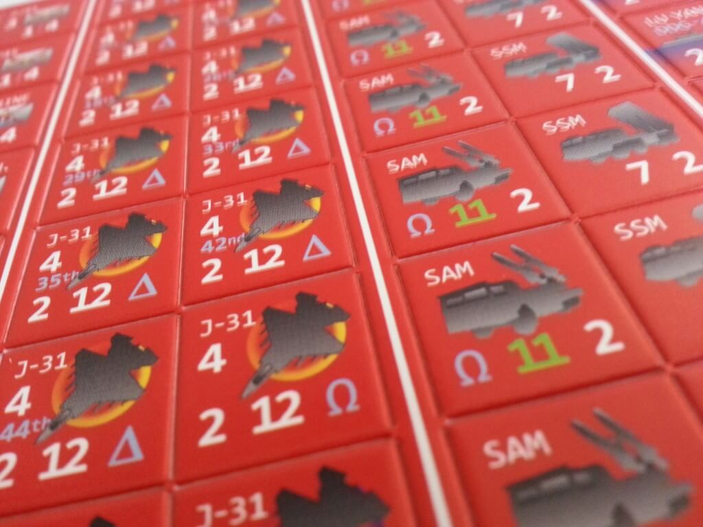
Here we can see Thailands c-130, Harriers etc.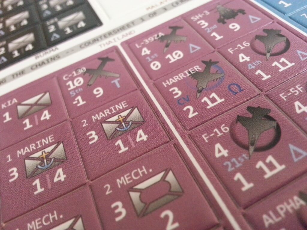
Finally – this struck me as odd. Print a black and white rule book, but insert a full color multi page glossy ad catalog. I applaud any attempt to market well, and the document is well done. On the flip side I can see people say….”hmm you can afford bull color ads, but not a full color rule book?”